Two days after Toronto's municipal election Michael Valpy and Daniel Leblanc in the Globe and Mail (“Federal political parties take notes on Rob Ford’s strategy,” Oct. 27, 2010) made passing reference to what is perhaps the best explanation of the results of the mayoral election.
Rob Ford was able to tap into and hold onto a broad and deep vein of resentment and hostility arising from tough economic times for the vast majority of wage earners in the city.
Valpy and Leblanc wrote:
"political strategists were near-unanimous in discounting any ideological shift in Toronto’s electorate as the reason the right-wing Mr. Ford was catapulted into the top political job in Canada’s largest city. Rather they talked about hostility as the driving force behind his victory, a hostility produced by growing inequality in Canada and aimed at people seen by Mr. Ford’s supporters as the well-educated privileged elites commanding huge salaries in the marketplace while their own incomes have gone nowhere in the past quarter-century, their household debt has sharply increased and they’re sandwiched between looking after elders and paying off their children’s education and they can’t see any way to get ahead.”
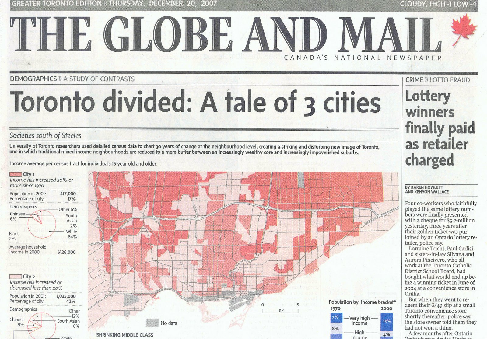
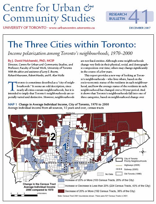
One increasingly well known graph about income trends in Toronto is the one below which charts the decline of the number of Toronto neighbourhoods in which people have, on average, “middle incomes” (defined simply as people with individual incomes 20% above or below the average for the Toronto metropolitan area for each of the census years in the graph).
Toronto was once a middle income city. The post WWII trend was one of more and more households having incomes that were on average in the middle (thus the widespread use of the term “middle class").
This trend began to reverse in the mid-1970s. Now, instead of Toronto being a city with a vast majority of middle income neighbourhoods (66% in 1970) it is a city with a vast majority of low and very low income neighbourhoods (53%). The number of very high income neighbourhoods doubled over the same period (from 7% to 15%).
This is referred to as income polarization – the two poles (high and low) growing at the expense of the middle. This is no way to build a cohesive, inclusive city or society.
Perhaps, however, this is only a city of Toronto problem. Is the trend different in what is deemed to be the "middle class" municipalities surrounding the city (i.e., the "905" area, the outer suburbs)? A good question. The answer: no.
The matching graph for the outer suburbs (the census metropolitan area of Toronto minus the City of Toronto), shows the same trend. Middle income neighbourhoods comprised 61% of the outer suburbs in 2005, compared to 86% in 1970. Nearly all of the decline of the middle shows up as low income neighbourhoods (from 0% to 20%). The income polarization trend in the outer suburbs is the same as in the city.


